Why Interior Design Colours Make or Break Your Bedroom’s Mood
Bedroom colour choices do more than enhance looks. Colour psychology studies how different hues shape our emotions and plays a vital role in the feel of your bedroom. Research proves that specific colours can either boost energy or help you relax.
Your bedroom needs to be a personal sanctuary. The colours around you shape your overall well-being. Blue helps you focus better and lowers blood pressure – perfect for peaceful sleep. Green gives your eyes a break and creates a soothing atmosphere. Cultural backgrounds and personal experiences can make people react differently to the same colours.
Colour psychology’s connection to interior design shows interesting links between your surroundings and emotional state. Light colours give bedrooms a more open and spacious feel. Dark shades add cosiness and intimacy. Yellow brings happiness and energy to your space. A carefully chosen red accent wall adds warmth and excitement.
This piece shows you how to use bedroom colours to create a mood-lifting sanctuary that matches your personality and requirements.
The emotional impact of colour in bedroom design
Colours can powerfully shape your bedroom’s psychological environment. Bedroom colours directly shape your emotional and physical responses. They do much more than decorate the space.
How colours influence sleep and relaxation
The colours around you while preparing for sleep affect your rest quality. People with blue bedrooms tend to sleep more than those with other colours. Blue helps lower blood pressure and heart rate, which creates perfect conditions for sleep.
With shorter wavelengths, your brain and body respond better to cool colours like blue and green. These colours naturally calm you down. Blue is the top colour choice among university students for study spaces because it helps them feel intelligent and peaceful.
With their longer wavelengths, warm colours such as red and yellow are more energizing. Red might be the worst bedroom colour choice. It raises aggression levels, blood pressure, and pulse rate. Your brain sees red as a warning sign and associates it with danger.
The way colours affect you depends a lot on bedroom lighting. A completely dark room works best for sleep, but the colours you see before lights out set your mind’s state. Rooms with matte finishes help you relax better than glossy ones that reflect light and keep your brain active.
The link between colours and wellbeing
Research shows strong links between specific colours and emotional states. Blue evokes feelings of relaxation, safety, satisfaction, and security because of how your brain processes what you see.
Green also creates positive feelings. People connect it with comfort, peace, space, hope, and happiness, which come from green’s natural connection to meadows and forests.
Blues and greens work well, but other colours offer unique benefits too:
- Soft purples and lavenders soothe you and create an elegant, relaxing space
- Neutral tones like beige, taupe, and ivory remind you of nature’s embrace
- Pale pinks bring peace and comfort, especially lighter reds like blush and rose
Your cultural background, personal experiences, and individual priorities shape how colours affect you. That’s why your perfect bedroom colour scheme should reflect your unique psychology.
Colour psychology goes beyond just affecting mood. A 2020 study showed that chromotherapy might help curb compassion fatigue and post-traumatic stress in intensive care nurses. This shows interior design colours could support mental health beyond just looking good.
The colours in your bedroom talk directly to your nervous system. They either help you relax or keep you active. Understanding these connections enables you to create a space that supports your well-being goals.
Exploring good room colours for different moods
Your bedroom’s interior design colours create unique feelings and moods that can change your daily life. Here are three colour families that design experts recommend to create peaceful, balanced bedroom spaces.
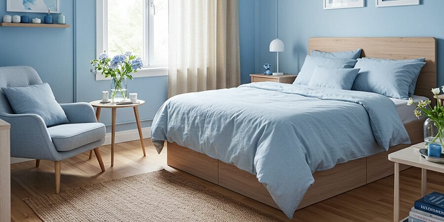
Blue for calm and focus
Blue is the best colour choice to help you sleep better and think clearly. This soothing shade connects us to peaceful elements like the sky and sea. Colour specialists have found that blue can slow the heart rate, lower blood pressure, and reduce anxiety. These physical effects make blue a perfect choice for bedrooms where you need to relax. Adding blue paintings to your walls can strengthen this calming effect while introducing visual interest through texture or abstract form.
Here’s what different blues can do for your bedroom:
- Light, pale blues help clear your mind and bring peace
- Teal blue with neutral tones adds sophistication
- Darker blues, mixed with grey undertones, help you sleep better
Design experts say blue is “synonymous with tranquilly and clear thoughts”. This makes it perfect if your mind races at bedtime. Blue helps declutter your space and thoughts, which explains why people love it in their bedrooms.
Without doubt, blue does more than look good research shows that college students pick blue as their top colour for study spaces because it helps them focus and stay calm.
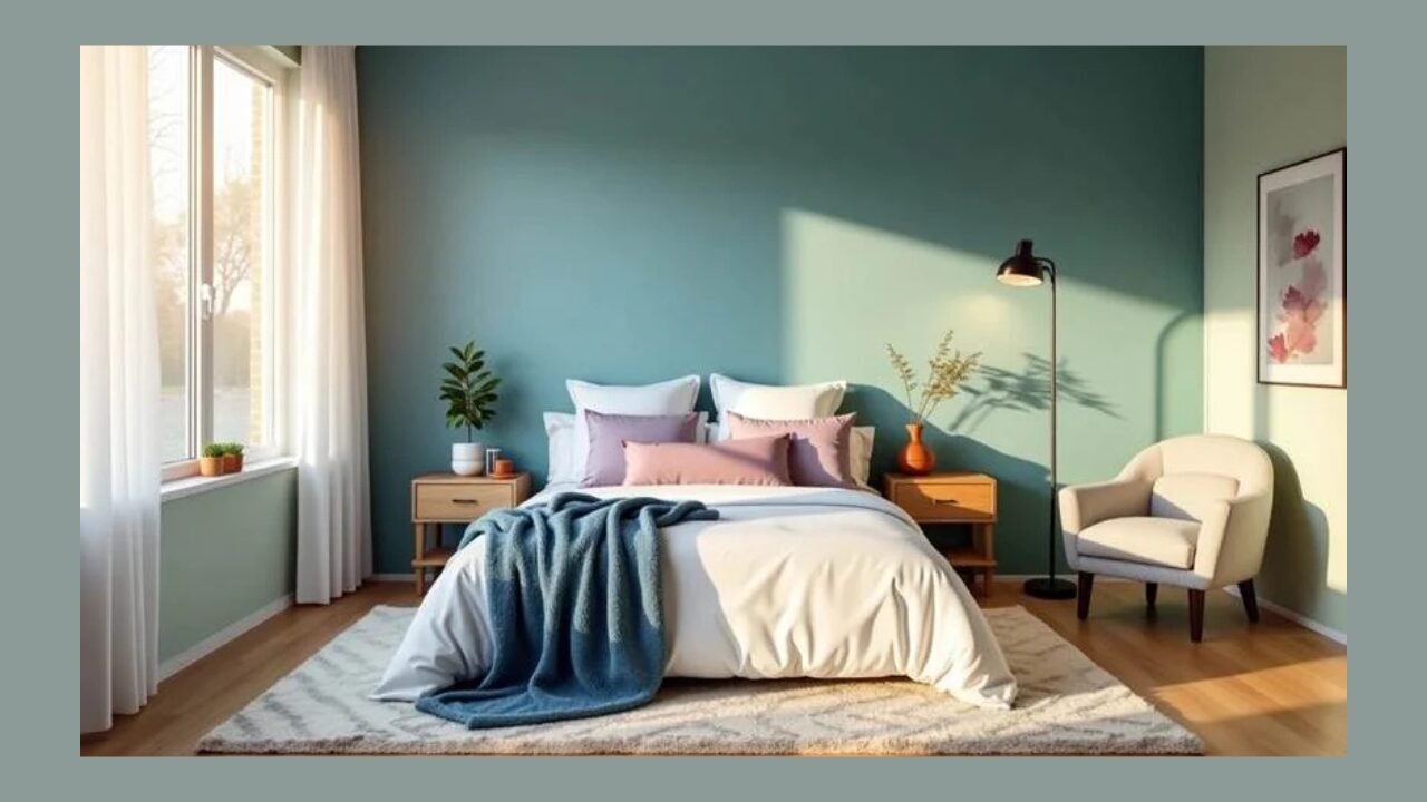
Green for harmony and renewal
Green brings nature’s healing power inside your home and perfectly balances energy and relaxation. This adaptable colour sits right in the middle of the spectrum, giving you a sweet spot between warm, energising colours and cool, calming ones.
Green stands for renewal and harmony. It is a great color for creating a peaceful bedroom sanctuary. Many interior designers say that “our desire to connect to the outdoors is still so strong—serene shades of sage, citrine, and moss help bring this feeling into your home.”
Sage green has grown more popular because it works well with many colours like grey, pink, sea green, yellow, and turquoise. This makes it an excellent base for your bedroom’s colour scheme.
Rich forest and hunter greens create a cosy, intimate feel that can make your space look bigger, not smaller. While most people think dark colours shrink rooms, these deep greens can “absorb light and blur the boundaries of a space”.
Lavender and soft purples for serenity
Lavender and soft purple shades blend peace with subtle energy. Like lavender’s scent calms you down, lavender-coloured walls or decorations create the same visual effect. These gentle colours work beautifully with whites, greys, and earthy tones.
Design experts describe lavender as striking “a balance between warm and cool, both relaxed and lively”. This makes it perfect for rooms where you want to relax without feeling sleepy.
Deeper purples add warmth when used as accent colours. Designer Palmer Weiss points out that mauve blankets and matching pillows give bedrooms “an enviable warmth.” This shows how purple touches can completely change neutral spaces.
The right shade makes your room look good and creates a space that supports your mental and physical health. Choosing your colours carefully makes your bedroom a true sanctuary that meets your emotional needs.
When bold colours work—and when they don’t
Bold colours can affect your bedroom’s mood. You should know how these colours affect you before you add them to your sleep sanctuary. This knowledge helps you choose the right time and way to use them.
Using red and orange as accents
Red and orange are powerful colours that stimulate your brain and body. They’re not the best choice for your bedroom’s main walls. Despite that, you can use these energetic colours as strategic accents. Red especially tends to raise your blood pressure and heart rate when used too much, which might make it harder to relax and sleep.
Colour theory experts suggest using these stimulating colours in 10% of your bedroom’s design. You can add them through:
- Decorative pillows or throws
- Small furniture pieces like bedside tables
- Artwork or picture frames
- Lampshades or vases
These small bursts of colour add interest without taking over the room. The best place to use red or orange is on the wall across from your bed, not behind it. This keeps these energising colours from filling your vision as you try to sleep.
Balancing dark tones with natural light
Dark walls create an intimate, sophisticated feel, but they absorb much more light than lighter shades. Without proper balance, your bedroom might feel smaller and darker than you’d like.
Natural light works perfectly against deep-toned walls. Rooms with big windows or multiple light sources handle dark colours better than spaces with little light. Dark colours don’t always make a room feel small—when used right, they can actually make it feel bigger by softening the room’s edges.
To make dark colours work in your design:
- Place mirrors where they’ll bounce existing light
- Pick matte finishes instead of glossy ones to cut down on glare
- Mix dark walls with lighter ceilings and trim to let the room breathe
Avoiding overstimulation in small spaces
Small bedrooms need extra care when it comes to bold colours. Intense colours in tight spaces can make the room feel busy and overwhelming, which might disrupt your sleep.
These approaches work well in smaller rooms:
- Follow the 60-30-10 rule: 60% primary colour (usually neutral), 30% secondary colour, and 10% accent colour
- Choose softer versions of bold colours—burgundy instead of bright red, terracotta instead of orange
- Use bright colours only in things you can easily change, not permanent features
Whatever your bedroom’s size, consider how different colours make you feel and affect your sleep. Colours that energise others might stress you out, depending on your experiences. Testing colours with samples or design tools before making final decisions helps create your perfect sleep space.
Cultural and personal meanings of colour
Colour meanings vary dramatically across cultures and individual experiences, beyond universal psychology. This variation explains why interior design colours can trigger different emotional responses in people who share the same space.
How culture shapes colour perception
Your cultural background shapes how you interpret bedroom colours. Western interior design associates white with purity and simplicity, whereas in many Eastern cultures it symbolizes mourning. These contrasting views show why interior design colour theory must adapt to cultural context.
Other notable cultural differences include:
- Red: Symbolises passion in Western societies, but represents luck and prosperity in China.
- Blue: Symbolizes calmness in Western cultures, but in some Middle Eastern countries, it’s believed to ward off evil spirits.
- Yellow: Brings joy to 52% of people worldwide, but symbolises mourning in Egypt.
- Green: Represents nature and health in many cultures, yet links to jealousy in some European traditions.
Interior designers work in various cultural settings, making these differences vital to understand. A study of 4,598 people from 30 countries revealed some shared emotional connections to colours—68% associated red with love, 50% linked pink with love, and 44% connected orange with joy.
Personal associations and emotional triggers
Personal experiences with colours often override both universal psychology and cultural norms. A designer’s story illustrates this well—they loved green but disliked racing green because it reminded them of their school tie. This negative memory shaped their decisions in professional design.
Research shows bedroom colour priorities reflect personality traits. People who love yellow tend to be innovative and original, while blue enthusiasts seek peace and thoughtfulness. Light blue fans typically want open and expansive environments, while those who prefer teal-blue appreciate complexity.
Your unique history creates emotional responses to interior design colours. Life experiences build associations between colours and memories, both good and bad. The perfect bedroom colour palette should reflect your personal emotional connections rather than follow strict colour psychology rules.
Creating a personalised bedroom colour scheme
Your bedroom’s colour palette should reflect your style. Rather than following trendy designs, you need a colour scheme that shows your emotional needs and priorities.
Steps to build your palette
The best bedroom designs start with something that inspires you. Choose a “hero piece” you love, such as a wallpaper, artwork, or fabric pattern, to inspire your entire design. This key element becomes your design anchor. Look for a “glue piece” that has multiple colours and goes together with your hero element to open up more colour options.
Next, examine the undertones in your selected pieces. Cool greens with blue undertones in your hero item mean other elements should align with these tones. Balance comes from mixing plenty of neutrals with your statement colours. Even rooms full of colour need places where your eyes can rest.
Incorporating interior design colour theory
Sir Isaac Newton created the colour wheel in 1666, which now helps designers create colour harmony. Professional designers often work with these approaches:
- Monochromatic scheme: Uses different shades of a single colour
- Analogous scheme: Features colours adjacent on the wheel
- Complementary scheme: Pairs of colours from opposite sides of the wheel
Interior experts recommend the 60-30-10 rule. This approach suggests your dominant colour should cover 60% of your room (usually walls), your secondary colour should take up 30% (typically furniture), and accent colours should fill 10% (accessories and decorative pieces).
Testing colours before committing
Colours often look different on your walls than they do on swatches. Paint large swatches (at least 2ft x 2ft) on multiple walls to avoid mistakes that can get pricey. Light affects each surface differently.
Watch your samples at different times—morning, afternoon, and evening. Natural light changes how colours look a lot. You can also use virtual room visualizers to try colours digitally before buying paint.
Conclusion
Colours affect your bedroom’s emotional state way beyond simple decoration. Science shows that choosing blues, greens, or lavenders can improve sleep quality and well-being. Your personal and cultural connections add layers to these choices, making your bedroom’s colour palette a personal choice rather than following standard rules.
Your bedroom design should factor in your psychological effects and gut reaction to different colours. Bright colours like red and orange add energy to spaces but work better as small touches rather than primary colours. Dark shades can make rooms feel cosy when mixed with natural light. Small rooms need extra care with darker colours.
The perfect bedroom colours start with finding pieces that appeal to you. Testing colors before committing helps save time and money, ensuring the final look aligns with your vision. The 60-30-10 rule helps balance your chosen colours without making the space feel busy.
Your bedroom should be your haven. The right colours support your style priorities and mental needs. Blues bring calm, greens restore, and purples soothe—your bedroom colours substantially affect how you feel in your private space. Taking time to pick these colours creates a space that nurtures your body and mind.
READ MORE
FAQs
Q1. How do bedroom colours affect sleep and relaxation? Different colours can significantly impact sleep quality and relaxation. Blue and green tones are particularly effective in promoting calmness and reducing heart rate, making them ideal for bedrooms. Conversely, warm colours like red and yellow can be stimulating and hinder sleep.
Q2. What does the 60-30-10 rule mean in bedroom colour design? The 60-30-10 rule is a design principle that helps achieve balanced colour distribution in a room. It recommends using 60% of a dominant colour (usually for walls), 30% of a secondary colour (typically for furniture), and 10% for accent colours (in accessories and décor). This approach helps create a harmonious and visually appealing bedroom space.
Q3. Can bold colours work in a bedroom? Bold colours can work in bedrooms when used strategically. They’re best incorporated as accents, comprising about 10% of the overall colour scheme. For example, vibrant reds or oranges can be effective in small doses through decorative pillows, artwork, or small furniture pieces, without overwhelming the space or disrupting sleep.
Q4. How do cultural backgrounds influence bedroom colour choices? Cultural backgrounds significantly impact colour perceptions in bedrooms. For example, while white symbolizes purity in Western cultures, it signifies mourning in certain Eastern cultures. Similarly, red might evoke passion in Western societies but signify luck in Chinese culture. It’s crucial to consider these cultural nuances when designing a bedroom.
Q5. What steps should I take to create a personalised bedroom colour scheme? To create a personalised bedroom colour scheme, choose an inspiration piece that resonates with you, such as a wallpaper or artwork. Identify the undertones in this piece and choose complementary colours. Refer to the colour wheel for guidance on creating harmonious combinations. Finally, test your chosen colours on your bedroom walls and observe them at different times of day before making a final decision.